Friday, November 5, 2010

Lab 11: Cheater Blinds

I did a second lab this evening, skipping over Lab 10 (because it's late and all of the coffee shops are closed). In this lab, you draw from old family photographs (preferably vacation photos) simple black & white line drawings. This is called "Cheater Blinds" because you are doing a modified blind contour drawing, drawing without looking at the paper for a minute or two and then looking at the paper once in awhile to make sure that your drawing isn't "overlapping too much." The author suggests that you move your hand at the same speed as your eyes when you are drawing.

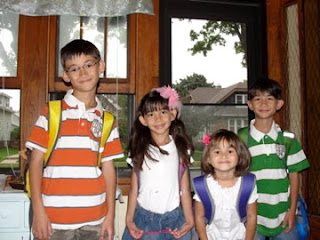
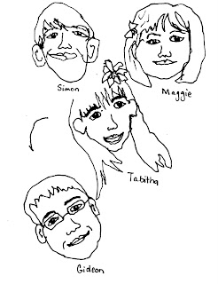
Here are my first few attempts next to the original photograph:
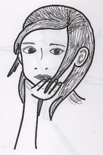
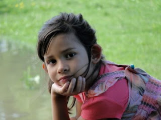

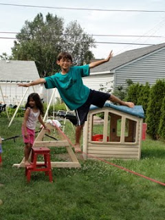
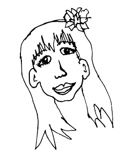
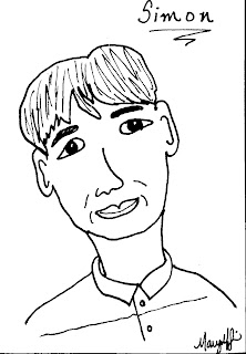
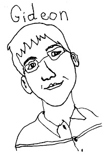
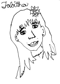
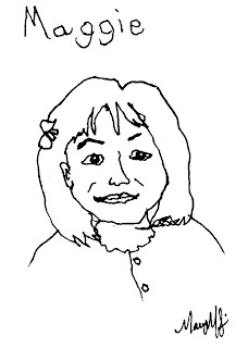
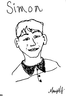
After drawing the outline with a fine-point permanent marker, you are to go back over the drawing with a finer point permanent marker and add in details, including shading, facial features, and texture. The drawings are to be simplistic and not-too detailed. In the first drawing of Tabitha, I added too much detail to her lips by adding fullness. I toned that down in the next drawing of Gideon. After a few drawings in my sketch book, and feeling more comfortable with the process, I drew a few more on Bristol for ATC cards. Here are those drawings:

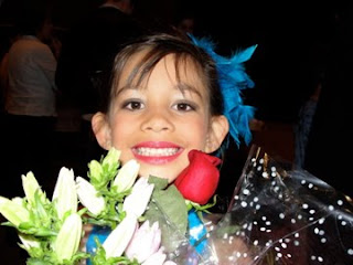
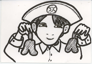
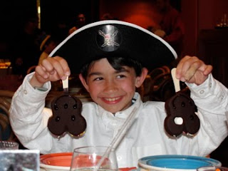


Simon's eyes are particularly challenging, as they were in lab 9. After a few attempts, I figured out that instead of being oval-shaped, his eyes have an upward curve on the bottom lid, as well as the top. I tried to reflect that in the ATC card.

Lab 24: Scribbly Drawings

Well, I've been jumping around a bit in the book, trying different sections, but trying to work through each section in order. Today, I went to the "Inspired by Children and Childhood" section and tried my hand at "scribbly drawings." Just as the name suggests, "scribbly drawings" are drawings that you scribble. Using a ball point pen, the idea is to first just scribble on a page for a minute or two, relaxing and trying different scribble designs. Here is my scribble page:


Next, you are instructed to look at something and draw it, using scribbling to create the image. The instructions state that this is not supposed to be a contour drawing. To avoid drawing the outline and then filling it in, the author suggests to start from the middle and go outward.

On my first try, I think I did an exact contour drawing:


Try again! I took a look at an old picture of my husband and myself. This picture, from 1997 is from before we were married. I was 23 years old in this picture:


Well, what do you think? Did I capture the essence of the photograph? I tried to complete these drawings without lifting my pen off the page, thus the connecting lines. Here are a few of my sketch book drawings:


I took these drawings and re-did them, a bit differently. This time I tried looking less at the page to create the one of my husband. I actually like his a bit better. I think the second one of me is too "cultivated."


And, I couldn't resist trying one of the little stuffed penguin that Tabitha loves so much. Here it is:

Saturday, October 30, 2010

Self Portrait Stencil

Today I'm veering away from the Creative Lab and working on a different project that I ran across. It's a self-portrait/stencil. I've made stencils of this type before, but never using Photoshop and I must say that using Photoshop as a tool is A LOT easier. The stencils that I've made involved just taking a picture and deciding for myself what to cut away. I was originally inspired to create these stencils by the artwork of Andrea Rogers, a Flickr friend of mine. Her stencil work is amazing! Here are two examples of what I've done in the past:


So, I thought I'd try this doing a Photoshop tutorial since doing the stencils from a regular picture is very difficult - - deciding what to cut and what not to cut. Kudos to Little Black Kitty for putting this together. So, what I did was to first find a decent picture of myself. That's easier said than done - - I think once you become a mom there really are no longer many pictures of yourself since the mom is the one behind the camera, usually. But, I did have a few that I took while fooling around with the Photo Booth application on my Mac. But, even then, not all pictures work well with Little Black Kitty's method. Most of the pictures that I had didn't have enough light on my face, I think, to make my features stand out. But, I did finally settle on this picture:


So, after fooling around with it in Photoshop, this is the image that I had to work with:


I printed the image on regular cardstock. I didn't take a scan of the "virgin" stencil, but here it is after playing around with it a few times:

And, finally, here is an image made using the stencil and StazOn ink that I applied with a sponge paint brush:

I do like the ease of using Photoshop, but I think that the detail was clearer in the stencils that I created. Of course, I could have veered from the Photoshop image a bit to give some more definition in my face, but I wanted to see what it would look like if I just cut all the black off. It's dramatic, but maybe a bit too dark? I think that I need to work on the definition around the eyes a bit more. There were white parts in the eyes of the photoshop image that were lost due to the fact that they were entirely surrounded by black and were therefor lost in the middle. But, still, I worked with this stencil and here's my ATC card:


Using the stencil, I applied the StazOn ink on plain newsprint paper. I like using newsprint when I want something to look a bit rustic - - I think it softens up the image. I then applied some stamps using dye-based stamp ink and also acrylic paint on the stamps. I chose a stamp of a non-descript cursive background, peacock feather and a stamp of a mandala. Using stippling brushes, I brushed on color in specific spots on the card. The card still needed something and I thought that defining areas of my face, as if applying make-up might work out. So, using colored pencils I defined my eyes and my lips. Finally, I used Inkadinkado blending chalks as if applying blush to my cheeks. Finally, I finished off the edges, bleeding it onto the front of the card a bit with more StazOn ink.

Friday, October 29, 2010

Lab 9: Wrong-Handed Portraits

Today's exercise involves drawing people with your non-dominant hand. According to the author, this is designed to help you get over your fear of not drawing a perfect picture. The rules are no erasing, so out came the black sharpie pens again. I worked from a picture of my four little ones (since the real four little ones are generally sleeping late at night, while I create). Here is the picture of (L-R) Gideon, Tabitha, Maggie, and Simon with their backpacks in different colors getting ready to leave the house for their first day of school, taken September 1, 2010:
Now, here's what I came up with on my first set of sketches, all done with my left hand:Pretty cool, huh?

Now, onto the artist trading cards. What I found is that I'm getting too good at drawing with my left hand. I used this technique with the cats, too, and after that exercise and then just the four drawings above, I created the following two drawings on Bristol vellum:


I wasn't very happy with these two drawings. It looks like I didn't even use my left hand. The lines are way too smooth. I think what I have here are just two bad drawings. Not at all what I wanted. I had to try over and over again to loosen up with my drawings. Looking away from the page helped to create a bit more freedom in my drawings. After many, many tries, here are the four cards that I am happy with, also on Bristol vellum using a black Sharpie pen:


Tabitha's portrait gave me the most difficulty with her hair. I actually started one drawing and set it aside and then, after many attempts, came back to that drawing and finished it up - - that's the one that I ended up choosing above. I really like these drawings and it's amazing how they seem to capture their personalities, as well. Simon's especially - who is a child who likes to please and make others happy, but is also a bit mischievous.

Thursday, October 28, 2010

Creative Lab Exercise 2: Blind Contour Giraffes

The idea here is to draw a giraffe, while looking at a picture of the giraffe and not your paper. It's best to keep your pen on the paper the entire time, but if you have to reposition, you can look while you reposition but as soon as you start drawing again, your eyes should be on the picture of the giraffe. Using old Childcraft books and images of giraffes on the internet, I drew several giraffes in different poses:Then, I decided to try a "taking it further" exercise and draw two giraffes - one on top of the other and add in lines and sparse coloring. Beginning to look abstract:


I really liked the giraffes that I drew above, so this is the basis for my ATC cards. I decided to re-draw what I created above. I just couldn't get the drawing right without it looking too contrived. So, I re-did the blind drawing exercise but on a paper that it ATC sized. I used the recycled/banana fiber paper that I had purchased from Target and I used a black marker to create the giraffes, drawing them "blind." I used my Copic markers to color in the spaces. I will keep this card for a live trade. The card is titled, "Abstract Giraffe."

Creative Lab Exercise 1: Draw A Cat - In Bed

I completed Lab 1 on October 27th. The project is to Draw Cats in Bed - - not to draw the cats in their bed, but to sit in your bed and draw cats. Why in bed? Something about the cushiness and comfort to loosen up your style.


Obviously, my style needed a lot more loosening up... so I drew with my left hand... and I drew with my right.. Drawing with my non-dominant hand (my left) did help to loosen me up a bit. I then found that I liked a certain style - - slightly off rounded heads, low set eyes that are far apart and a long nose. I stuck with that for awhile and drew more and more cats ~ 31 in all.

After I finished up the sketches, I chose a few of the cats for inspiration and made a set of four ATC cards. Here is the only one that I manged to scan in and save: I used a paper that I bought at Target that was 80% recycled paper and 20% banana fibers and stamped the background using Staz ink and a non-descript cursive stamp. Using acrylic paint, I painted the cats and then finished them off with an outline in black ink. This is cat#4. This cat will go in my live trade binder while the other three are off to Chris over at ATCHandDrawPaint (a Yahoo ATC trading group) for a cat-themed swap.

Get Your Muse On


I have been working on an exercise in creativity as of late - - something to work on getting my creative juices flowing and to exercise my drawing abilities. I saw this book at Michael's and knew that I just had to have it. So, once I got back home, it was onto the internet to see if the Milwaukee Public Library carried it and.... they did! I waited for this sucker to arrive for over two weeks and now, it's here - - in my home, for me to use and to renew and to use and to renew until they no longer let me and then to reserve and renew again. So, if you haven't checked it out, yet, I highly recommend it. It's basically a series of creative exercises to use however you want to. I'm trying to do one of the exercises a day and then to make one or a few ATC cards based off of what I do in my sketch book. As I work through this book, I will be writing about it. Hey - - maybe you'd like to work through it with me? Get the book and share with me what you're working on!

Why am I doing this and do I really have time? I have been wanting to blog about my wanderings for awhile now, but I don't want the blogging to get into the way of my wanderings. I am a dabbler - - a little of this and a little of that. I dabbled in Etsy for awhile and I really liked Etsy but the minute that I start getting paid for something, I no longer love it. Is that weird? I think this is why ATC cards suite my fancy - - I'm not getting paid to do it, there is a great variety in what I can and do make, and once it's created, it's gone - - given away and never to be seen by my eyes again. This is really the ultimate exercise in detachment. At first, I was so attached to my cards that I would make an extra for myself and then I would just scan in the cards and make a good quality copy, then I would just scan them in and now I just send them out. For blogging, though I'll have to do some scanning or I wouldn't have anything to show about what I'm up to. So, here goes... I'm blogging about my art (and probably my life). Here's to detachment and persevering in the bloggosphere!